Project Overview
Duration: 3 months (2018)
Role: UX Researcher, UX Designer
Category: Education, Web, K-8
Software: Adobe XD, Photoshop, Illustrator, After Effects
I led a team of six designers to help homeschooling startup Prenda assess young students' performance and identify pain points. Despite students' satisfactory with the learning environment, Prenda tasked us to identify opportunities to boost students' performance and learning quality.
Our Client
Prenda is a homeschooling service that empowers students by letting them take ownership of learning with online resources such as Khan Academy and Code.org. A group (8~10) of children learn together under an instructor that guides and encourages them in individual learning sessions and group activities.

This project was affiliated with Arizona State University. To learn more about Prenda, please visit their website or contact Kelly.
The problem
Prenda's research showed mixed results in their students' performance.
Most students were really happy with the learning environment and weren't showing signs of struggling during the coursework. Our initial goal was to identify if there was anything hindering students' learning experience or opportunities to boost learning quality.
Research
Understanding students' motivations and pain points

We joined their morning class at Kelly's house with his students. After sitting down in their early meeting, we observed and interviewed students and instructors to learn how they used the Prenda app and how they interacted with each other. We realized that Prenda's learning model wasn't only about the app but also the interaction between students and the instructor.

PRENDA COIN APP
User flow analysis

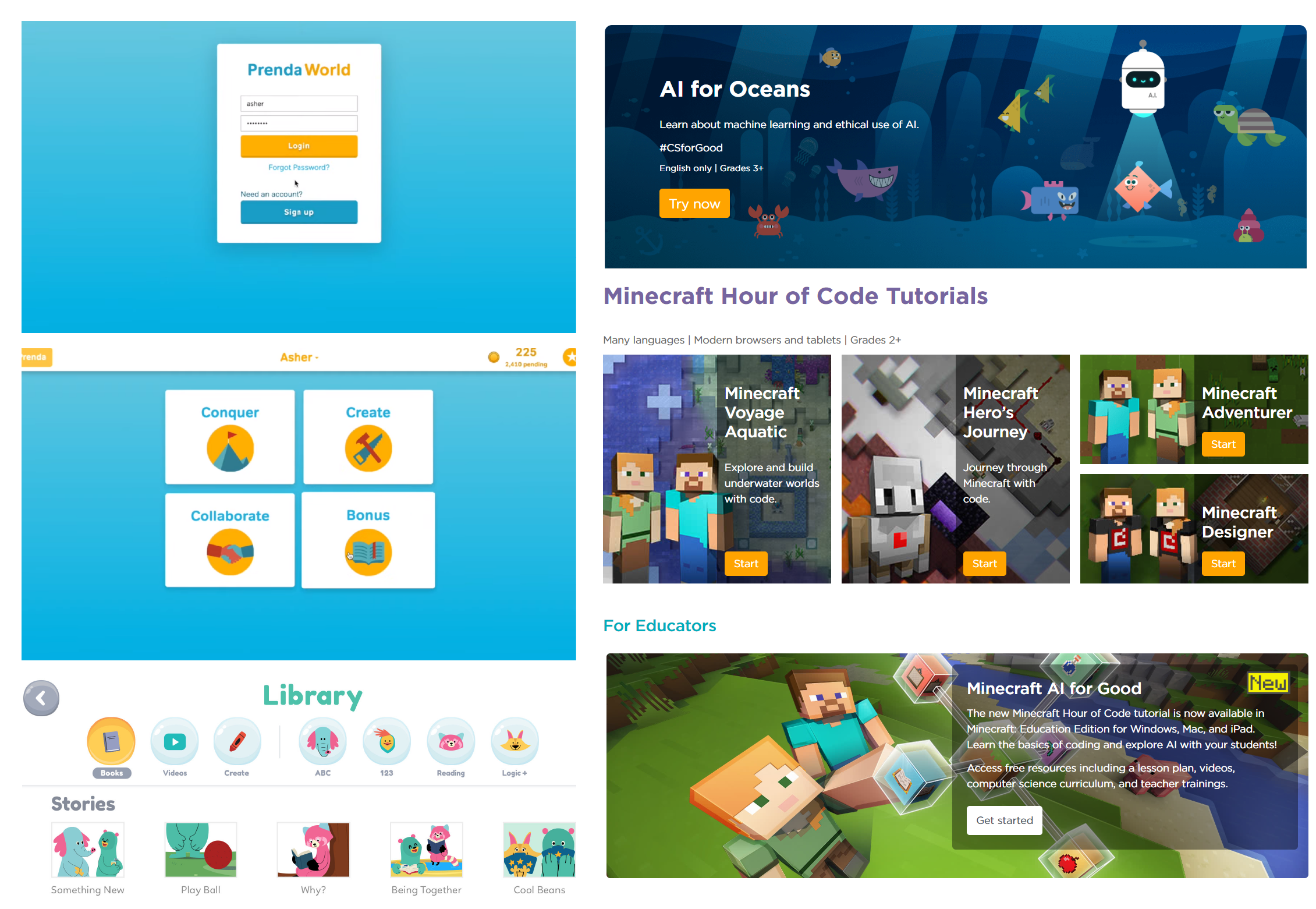
Students spent most of their time in Conquer Mode:

Students set their daily goals then visit external learning platforms in new tabs. After finishing the courses, they return to the app and manually record their progress. After each goal completion, students earn coins that can be saved to purchase rewards such as snacks, ping pong time, and videogame time.

We carefully examined Prenda's app and identified several pain points that were also observed during the interview:

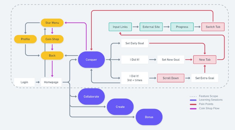
  • (00:08) Conquer mode was clustered with different goals that made tracking the overall daily progress difficult.
  • (00:12) Switching between new tabs made it hard to navigate the browsers on their small Chromebook screens.
  • Returning to homepage was required after every mode although it doesn't provide any information.
  • Coin shop returned students to the homepage regardless of where they were.
data Analysis
Empathy map & affinity map

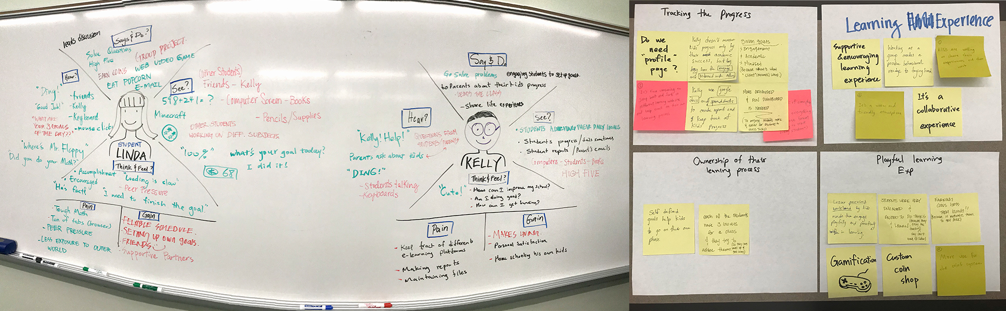
With the empathy map and affinity map we were able to categorize students’ incentives as the following:

  • Achievements: Kids loved to share their progress with others. High-fives and encouragement from the instructor really kept them going.
  • Engagement: Students got lost in certain gamified platforms such as the Minecraft coding game. They would forget the daily tasks and keep coding until the instructor reminded them.
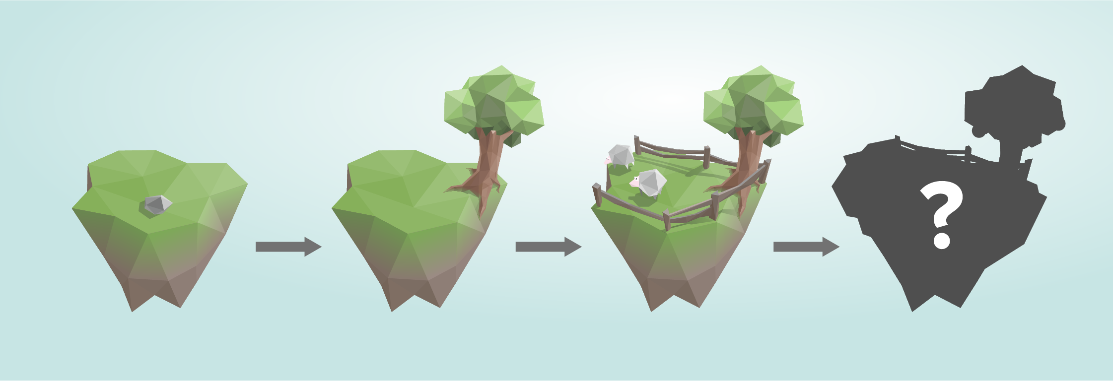
  • Progression: The app awarded them with coins, which could be exchanged for popcorn, park visit, or videogame time. Some students just hoarded coins and enjoyed exhibiting the wealth they’ve built.
  • Support: Students don’t compare their academic success and advance at their own pace. The atmosphere was fairly supportive with everyone helping each other and collaborating on group projects.

The findings that aligned with our initial goal during our research phase were the followings:

  • Rugged user flow complicated simple tasks and didn't match students' learning routines.
  • Progression tracking was lacking, leaving students unaware of their past achievements. Also some students would "skip" the lessons to earn rewards.
  • Sense of achievement engaged and motivated students to take on challenging subjects and move beyond daily goals.
Problem reframed
How might we boost students' performance and learning quality with refined user flow and improved progression tracking that provide them a better sense of achievement?
ideation
prioritizing features
developing ideas that better fit users' needs

Features were prioritized based on their impact and ease of implementation. We chose progression tracking ideas with the following directions:

  • Playful elements encourage and engage students, helping them go through tough subjects with rewarding feedback.
  • Interactive UIs give a better understanding of individual progression and provide a stronger sense of achievement.
Co-creation workshop
"Here's a flower. what would you do?"

We invited students, instructors, and parents to join our mini workshop. The objective was to explore our ideas with the stakeholders. We created interactive paper slideshows and stories. The co-creations helped us iterate our features.

Story
Iteration
A flower that thrives under the help of the students
Visualized progression that grows with students to provide incentives to learning
"This is Creeper sssSSS"
Drew by one of the students
Implementing visual elements from other titles they loved to better engage students
Wireframing
further developing ideas

Building on our insights from the mini workshop, I sketched out ideas to better organize information for students to understand their progression. We also wanted to implement features that give incentive to learn while maintain a refined userflow.

UX Direction
proposed feature
a. Homepage Removal
GREETINGS FROM YOUR LEARNING BUDDY
Students have a fixed daily schedule, so instead of choosing bonus and conquer mode from the homepage, the app leads them directly to the destinations.
matching students' daily routine
We removed the hub page to have each session show up consecutively
(❶-❷-❸-❹). This halved the required actions to navigate and helped students focus more on each session.
Tracking browser extension
To eliminate the need of constantly creating and switching tabs, we proposed an browser extension to guide students to their next destinations once the current goals are achieved. Moreover, automatic tracking ensures students' learning quality.
b. Conquer Mode Revamped
organized daily goals
The new Conquer Mode organized all their daily goals into one screen. Beside the required Math and English goals, student can choose their third goal from the drop down menu.

The lock icons communicated that students have to finish the required subjects in order to unlock bonus goals. This prevents students from getting lost in coding games and forgot to work on the fundamental subjects.
Original low-poly art created by Gorkhs@pixabay
Progress visualized
To help students visualize their long term progression, we proposed living milestones that evolve as students learn. Each stage represents different checkpoint of the individual annual goal and incentivizes students to work towards their next goal.
c. Art Direction
Screenshots taken from Prenda Coin App, Khan Academy, and Code.org
Bridging the gap
We took visual inspiration from their current app as well as other online platforms students were familiar with to help bridging current users to the new user flow.